Tuesday, 29 March 2011
Friday, 25 March 2011
Evaluation Question 1
In what ways does your media product use, develop or challenge forms and conventions of real media products?
Deadmau5 - I Remember Music Video
Deadmau5 & Kaskade - I Remember (Edit)
Deadmau5 - I Remember ( Full Length) Music Video
Deadmau5 & Kaskade - I Remember (Full Length)
Queen - Another One Bites The Dust Music Video
Queen - Another One Bites The Dust
Queen vs. The Miami Project - Another One Bites The Dust Music Video
Queen vs The Miami Project - Another One Bites The Dust
How does my Digipak use, develop or challenge forms and conventions of real media products?


Our design, in comparison to real media digipaks, follows the conventions through:

Deadmau5 - I Remember Music Video
Deadmau5 & Kaskade - I Remember (Edit)
Deadmau5 - I Remember ( Full Length) Music Video
Deadmau5 & Kaskade - I Remember (Full Length)
Queen - Another One Bites The Dust Music Video
Queen - Another One Bites The Dust
Queen vs. The Miami Project - Another One Bites The Dust Music Video
Queen vs The Miami Project - Another One Bites The Dust
How does my Digipak use, develop or challenge forms and conventions of real media products?

The common conventions of a digipak, similar to an album, will include
- Artist/band name, on the front cover and spine
- Photography or graphic imagery, of the band or design - visually attract their audience.
- Recurring theme of colours and imagery throughout the digipak.
- Track listing on the back panel.
- Disc in tray, or a slot between panels.
- Barcode and logos on the back cover.
- Possibly a 'Special Edition' sticker.
Our design, in comparison to real media digipaks, follows the conventions through:
- Digitally designed imagery - Sticking with the cartoon style of Gorillaz, we chose a graphic design as opposed to photographic.
- Using imagery separate to the music video. - By not using imagery of our central protagonist, or including similar themes, it is clear that it is an album release not just a single.
- Including the band name and album title on the front cover and spine, in a font that links to the theme. - We also chose to have it across the inside panel in which the CD and DVD will slot into.
- Back panel includes the track listing, bonus DVD listing, logos, copyright, and barcode.
- 'Special Edition' sticker
How does my Magazine Advert use, develop or challenge forms and conventions of real media products?
Common conventions of magazine adverts include matching imagery to the band/artists digipak. A reason for this could be so that it is easy for consumers to see the advert and then find the album by the matching covers. The adverts will also, obviously, include
- the band/artist name
- album title
- release date
- available formats
- where the album can be bought
- website address
- songs - usually high chart toppers or special editions.
We aimed to cover the majority of conventions of magazine adverts, to create an effective and realistic magazine advert, which we thought would be published in magazines like Q and NME, to reach the target audience for the band.
The main way which we have contrasted against the conventions, is by using different imagery for the advert and digipak. This was to create a bold image that stands out of a magazine advert, and be able to incorporate different ideas that we had for our ancillary texts. Although in doing this, we developed on the convention by including imagery of the digipak design in the bottom right corner, so that fans would be able to know what the album imagery looked like.
Recently, there has been an increased popularity of vinyl, which has been covered in our format of release.
'Featuring 19/2000 soulchild remix' was advertised as we believe this is one of the most well known songs on the album, and is also the track that has a music video for.
Evaluation Question 2
How Effective is the combination of your main product and ancillary texts?
Evaluation Question 2 from Beth Cooper on Vimeo.
Modestep - Feel Good [band-made music video]
Evaluation Question 2 from Beth Cooper on Vimeo.
Modestep - Feel Good [band-made music video]
Evaluation Question 4
How did you use new media technologies in the construction and research, planning and evaluation stages?
Tuesday, 15 March 2011
Final Rough Cut
Final rough cut, with annotations about what we still need to improve for our final cut, and trying to prompt audience feedback.
Monday, 14 March 2011
Digipak Design
Our first draft of our digipak:
 After audience feedback, giving areas to improve on, such as more colour themes to link it with our magazine advert, we have produced our final digipak.
 There are some obvious changes we have made, such as flipping the bottom half design, as the previous had the speaker as the back cover, and the track listing was on the inside. We have also added more of the colour theme and shading on the lettering to be more similar to the magazine advert and continue the theme. The text has changed on the back of the digipak, making it easier to read, 'stencil' font, to link in with the graffiti style. The conventional details are also added to the back of the digipak, such as record company logos, copyright information and barcode, to create verisimilitude of it being a real digipak.
The addition of the spray cans was an idea from audience feedback, and was place on the side which would be the spread in the middle of the digipak where the CD and DVDs will be, to include some imagery on that side aswell.
Overall I am happy with this design, as I think it is suitable for our brand image, and is eye catching and different to the common digipak design.
 We have designed a sticker to go on the digipak, promoting the special edition and 'featuring 19/2000 soulchild remix music video'.
The design background was taken from the original digipak design, from the speaker, and text added. This creates a sticker that matches with the theme of the digipak, but also stands out with the text, which also links in with the colour theme of the digipak and magazine advert.

Here is our final digipak design.


The addition of the spray cans was an idea from audience feedback, and was place on the side which would be the spread in the middle of the digipak where the CD and DVDs will be, to include some imagery on that side aswell.
Overall I am happy with this design, as I think it is suitable for our brand image, and is eye catching and different to the common digipak design.

The design background was taken from the original digipak design, from the speaker, and text added. This creates a sticker that matches with the theme of the digipak, but also stands out with the text, which also links in with the colour theme of the digipak and magazine advert.

Here is our final digipak design.
Sunday, 6 March 2011
EG - Our Magazine Advert & Audience Feedback
Our Magazine Advert
We decided to stick with the theme of using cartoons which beth and I drew ourselves, for the album advert and the digipak cover. This means that our digipak and magazine advert tie together as a package.
As the album is for a compilation of Gorillaz remixes, we chose to draw a picture of a DJ at a mixing table, which ties the theme of remixes and the imagery of the advert together.
After researching the existing examples of magazine adverts from Q magazine, we narrowed down what need to be on the adverts. This included:
- The band or artists name
- The album title
- A release date
- Available formats
- A web address
- Advertises songs it includes
- Advertises where to buy album
Here is our first draft of the magazine advert:

The audience feedback we gained from this was that the theme of remixes and the DJ imagery works well, but it was also suggested that we definately need to add some colour.Also that the date shouldn't be larger than the album title.An advert or link to a place where you can purchase this album such as iTunes, Amazon, HMV etc.It was suggested we could add some information on what the special edition digipak includes.It was also suggested that festival season would be a better date to advertise the release date.And due to the increase in popularity recently of vinyl, we could add that as another available format of the album.Here is our second draft:
 I have added to this, colour which matches the digipak, as it is a common convention of magazine album adverts for the imagery to match the album artwork, although we have challenged this convention as our album artwork doesn't match the advert I have also added an image of the album, so that an audience would know what to look for when purchasing the digipak.I added the small image link to iTunes, beacause after a quick survey of asking people if they owned an iPod, most of which did and also wether they use iTunes to download music or listen to their music files on their computers, again most said that they had and did. Therefore iTunes seemed like the most popular choice. It also adds some authenticity to the advert.Finally i added the small section on what the digipak contains, for which I took inspiration from existing examples of bonus features.I hope to upload this and our digipak to facebook in order to get some audience feedback from a variety of age ranges but mostly our target audience, and find out whether they think our digipak and magazine advert work well and are effective in drawing in the target audience.
The feedback we gained on this 2nd draft was that the colour of pink/purple on the text is "perfect".
The combination of only 3 colours are "simple yet effective".
It looks professional
They like the graffitti style of writing on the Gorillaz
The advert is in keeping with the 'youthful' style of the digipak
They also suggested that we should:
- Use the same pink text on more of the white text
- Make the text on the digipak features stand out more, for example: in shape of a record.
- Re-order the writing as it is a little squished up
- Compress 'THE REMIXES' so that the edges of the letters arent lost
Here is our third draft:

Here we have edited the sections which we were told needed some work from our audience feedback.However Beth and I have decided we dislike the text in the shape of a record, we don't think this works well so with our next draft we will straighten that back out again. Other than that we are happy with this design.
Here is our final design:

The audience feedback we gained from this deisgn helped us decide that this was the one we would use as it wasn't suggested anything needed changing and also that it looks proffesional.
As the album is for a compilation of Gorillaz remixes, we chose to draw a picture of a DJ at a mixing table, which ties the theme of remixes and the imagery of the advert together.
After researching the existing examples of magazine adverts from Q magazine, we narrowed down what need to be on the adverts. This included:
- The band or artists name
- The album title
- A release date
- Available formats
- A web address
- Advertises songs it includes
- Advertises where to buy album
The audience feedback we gained from this was that the theme of remixes and the DJ imagery works well, but it was also suggested that we definately need to add some colour.
Also that the date shouldn't be larger than the album title.
An advert or link to a place where you can purchase this album such as iTunes, Amazon, HMV etc.
It was suggested we could add some information on what the special edition digipak includes.
It was also suggested that festival season would be a better date to advertise the release date.
And due to the increase in popularity recently of vinyl, we could add that as another available format of the album.
Here is our second draft:
I have added to this, colour which matches the digipak, as it is a common convention of magazine album adverts for the imagery to match the album artwork, although we have challenged this convention as our album artwork doesn't match the advert I have also added an image of the album, so that an audience would know what to look for when purchasing the digipak.
I added the small image link to iTunes, beacause after a quick survey of asking people if they owned an iPod, most of which did and also wether they use iTunes to download music or listen to their music files on their computers, again most said that they had and did. Therefore iTunes seemed like the most popular choice. It also adds some authenticity to the advert.
Finally i added the small section on what the digipak contains, for which I took inspiration from existing examples of bonus features.
I hope to upload this and our digipak to facebook in order to get some audience feedback from a variety of age ranges but mostly our target audience, and find out whether they think our digipak and magazine advert work well and are effective in drawing in the target audience.The feedback we gained on this 2nd draft was that the colour of pink/purple on the text is "perfect".
The combination of only 3 colours are "simple yet effective".
It looks professional
They like the graffitti style of writing on the Gorillaz
The advert is in keeping with the 'youthful' style of the digipak
They also suggested that we should:
- Use the same pink text on more of the white text
- Make the text on the digipak features stand out more, for example: in shape of a record.
- Re-order the writing as it is a little squished up
- Compress 'THE REMIXES' so that the edges of the letters arent lost
Here is our third draft:
Here we have edited the sections which we were told needed some work from our audience feedback.
However Beth and I have decided we dislike the text in the shape of a record, we don't think this works well so with our next draft we will straighten that back out again. Other than that we are happy with this design.
Here is our final design:
The audience feedback we gained from this deisgn helped us decide that this was the one we would use as it wasn't suggested anything needed changing and also that it looks proffesional.
Friday, 4 March 2011
EG - Magazine Album Advert Research

 As Gorillaz are a well known band worldwide, we wouldn't need to focus on smaller budget, or less well known music magazines.
 Though as the bands creator, Murdoc Niccals is British, the bands largest fan base is most likely to be British as well.
For this reason we think that main stream British music magazines such as Q or NME would be the best to look into for our music magazine research.
As well as this both Q and NME have their own radio stations and also music channels which ties in nicely with the production of our music video for the track. This is an example of globalisation and how companies are expanding from their original sources, out into other aspects of the media and entertainment industry.
Both these magazines don't specialise into one specific genre of music either which makes them ideal as our dance remix of a Hip Hop track is harder to specify as one set genre, and therefore focus our attention on one type of magazine.
Existing Examples of Album Adverts:
We scanned some full page album adverts from a 2009 copy of Q magazine.

- A single full page album advert for the band Lightning Seeds
- Basic information included - Album title, band name, available formats 'CD/DOWNLOAD', release date, web address, record label.
- Band name and Album title are equal in size
- Photographic imagery - the same as album cover

- A single full page album advert for the band Manic Street Preachers
- Information included - Band name, album title, release date, Names of band members and other + their job roles, available formats 'CD / DELUXE 2CD / LP/ DOWNLOAD, wed address, record label, advertises amazon.co.uk as a way to purchase the album.
- Band name is larger than Album title
- Imagery is of a professional painting by an artist- the same as album cover

- A single full page advert for the band Maximo Park
- Information included - Band name, album title, release date, available limited edition CD including performance footage, wed address.
- Also advertises new single release, and available formats of that
- Album title is larger than band name
- Font of band name is recognisable of their image/brand
- Imagery is computer generated - the same as album cover

- A single full page advert for the band The Enemy
- Baic information included - Band name, album title, featuring - 'song title', available formats 'CD/Special Edition/Digital, already released, wed address
- Band name and album title are the same size
- Imagery is computer generated - the same as album cover

- A single full page advert for the band Green Day
- Basic information included - Band name, album title, available format, release date, includes - 'song title', web address.
- Advertises what their website has to offer
- Has an introductory sentence 'The wait is finally over...'
- Band name is larger than album title
- Font of band name is recognisable of their image/brand
- Imagery is of graffiti art - the same as album cover.

- A single full page advert for the band Depeche Mode
- Information included - Band name, album title, already released, available formats - 'CD / CD+DVD / VINYL+CD / BOXSET / DOWNLOAD', tour dates and venues, web address.
- This advert is also promoting the bands tour and advertises where to purchase tickets
- Font of band name is a recognisable link to their recent comeback and 'tour of the universe' tour in 2009
- Imagery is computer generated - the same as album cover
- Also includes smaller images of album cover.

- A single full page advert for the artist Bob Dylan
- Information included - Artist name, album title, album description 'studio album', release date, available formats - 'CD / DELUXE CD / VINYL / DOWNLOAD', wed address, record label.
- Advertises HMV as a place to purchase the album.
- Artist name is larger than album title
- Photographic imagery - the same as album cover
General Codes and Conventions of Magazine Album Adverts :
- include band / Artist name
- include album title
- give a release date
- inform of available formats
- include a web address
- advertise songs it includes
- advertise where to buy album
- match imagery to album cover or use photographs of album cover on advert
Some less well know bands had smaller half, or quarter page album adverts in the magazine such as:


As these bands are less well known, they probably are unable to afford a full page spread which in Q magazine costs £9,156 [statistics from www.bauermedia.co.uk/ratecard]
However, as Gorillaz are equally as well known as some of the larger bands such as 'The Enemy' or 'Green Day' they would be able to afford a full page spread in a more popular British music magazine.
Thursday, 3 March 2011
Role of Audience Feedback
Audience feedback has been an important part in developing our production.
When watching our first rough cut to our final rough cut, it is clear that we have been influenced by some of our audience feedback.
Whilst editing, it is difficult to have a refreshed look on the production, therefore it is helpful for an outsiders views on how the video works on the whole, and help influence new ideas, whether it be editing or re-shoots.
We've received feedback through our classmates and other sixth form students, as well as some feedback through facebook.


 \
\
Audience Feedback on Magazine Advert and Digipak from Beth Cooper on Vimeo.
Target audience watching our final cut
We gathered some media students from our class, as well as other sixth form students who don't take media, and majority who have not seen, or been involved in the making of our production, to get their feedback on our final cut.
Audience Feedback on our Final Cut from Beth Cooper on Vimeo.
When watching our first rough cut to our final rough cut, it is clear that we have been influenced by some of our audience feedback.
Whilst editing, it is difficult to have a refreshed look on the production, therefore it is helpful for an outsiders views on how the video works on the whole, and help influence new ideas, whether it be editing or re-shoots.
We've received feedback through our classmates and other sixth form students, as well as some feedback through facebook.


From our rough cuts on YouTube
 \
\Target audience discussion on our Magazine advert and Digipak
The other students in our media class, who had not previously been shown our axillery texts, were shown the rough drafts and we had a discussion on their effectiveness as promoting the band, and how they could be improved.
Target audience watching our final cut
We gathered some media students from our class, as well as other sixth form students who don't take media, and majority who have not seen, or been involved in the making of our production, to get their feedback on our final cut.
Audience Feedback on our Final Cut from Beth Cooper on Vimeo.
Wednesday, 2 March 2011
Gorillaz Album Art
Formed in 1998, Gorillaz' first album came out in 2001. Named Gorillaz, their first album consisted of some of there most well known tracks.
 Their first album is a graphic image of the band in the same 'geep' as featured in the 19/2000 music video. The album art is simple, with just the car on the white background and the band name tagged in graffiti, and the parent advisory.
 The back cover


In 2002, Gorillaz released the compilation G-Sides.
As a 'B-Sides' Collection to their first album, featuring the additional tracks from their first three singles and the Tomorrow Comes Today EP.
This is the album in which 19/2000 SoulChild Remix first came out on, as the first song on the album.
All versions have the same cover, featuring Noodle with a skeleton doll in her hand, except for the Canadian, Japanese and Australian versions. [Wiki]

There is similar aspects between this album cover and their previous, such as the graffiti style writing on Gorillaz, and the cover featuring all the band members, even though there is the one that is in the foreground.
The back cover has a similar style, featuring the band, city buildings and graffiti.
 Laika Come Home is another compilation released in 2002.
It isn't a typical remix album, and instead of having variety of artists remixing the songs, is done by just one group, Spacemokeyz.
The album contains most of the songs from Gorillaz' first album, but remixed in a dub and reggae style.
In 2004, the album was packaged with 2001 Gorillaz in a limited edition box set as part of EMI's "2CDs Originals" collection.
The album cover is different to the usual artwork of Gorillaz, the imagery is of a space monkey, on the background of a map of the stars, edited with text such as 'Spacemoney versus Gorillaz'.
There is also a sticker added on to this version, in which some images of the album art work don't have. The sticker gives an insight into the album, with the band, remixers, a brief description and other artists that it features.

Demon Days is the second studio album, released in 2005.
The album cover is reference to Let it Be by The Beatles.
Featuring all 4 members, and moving away from the graffiti band title, but staying quite simple in the imagery.

A little bit different to the front cover, not so simplistic. There is the element of graffiti that is recurring in their album art, as well as the band members.
Like G-Sides to Gorillaz; D-Sides is the B-side album to Demon Days.
Released in 2007, D-Sides contains remixes and B-side tracks.


'Have a look at this exclusive image of the contents of the D-Sides deluxe package below! In one of Gorillaz most spectacular packages yet, there are plenty of goodies to be had with this 2-disc set. In addition to fantastic new images from longtime Gorillaz friend and collaborator Jamie Hewlett, the amazing box also features a patch and more new stickers! Also note that the release date of D-Sides has been amended to 19th November in the UK and 20th November in the USA.' [Gorillaz fan blog]
 The third studio album, released in 2010 is their most recent album, Plastic Beach.
Comparing to their first album cover, Plastic Beach seems a more graphically animated image as opposed to the simple graphics of the band members.
They also have used different text type to the graffiti style.

The Fall was released on the 25th December 2010, as a free download on the Gorillaz website, exclusively to fans in the band's Sub-Division fan club.
The entire album was recorded on Damon Albarn's Apple Ipad, during part of their World Tour. Plans have been announced for the album to get a physical release, scheduled for April 2011.

 The back cover
features graffiti, one of the band members and the album tracks.
This emphasises the street
style of Gorillaz.
Special Digipak edition:


In 2002, Gorillaz released the compilation G-Sides.
As a 'B-Sides' Collection to their first album, featuring the additional tracks from their first three singles and the Tomorrow Comes Today EP.
This is the album in which 19/2000 SoulChild Remix first came out on, as the first song on the album.
All versions have the same cover, featuring Noodle with a skeleton doll in her hand, except for the Canadian, Japanese and Australian versions. [Wiki]

There is similar aspects between this album cover and their previous, such as the graffiti style writing on Gorillaz, and the cover featuring all the band members, even though there is the one that is in the foreground.
The back cover has a similar style, featuring the band, city buildings and graffiti.

It isn't a typical remix album, and instead of having variety of artists remixing the songs, is done by just one group, Spacemokeyz.
The album contains most of the songs from Gorillaz' first album, but remixed in a dub and reggae style.
In 2004, the album was packaged with 2001 Gorillaz in a limited edition box set as part of EMI's "2CDs Originals" collection.
The album cover is different to the usual artwork of Gorillaz, the imagery is of a space monkey, on the background of a map of the stars, edited with text such as 'Spacemoney versus Gorillaz'.
There is also a sticker added on to this version, in which some images of the album art work don't have. The sticker gives an insight into the album, with the band, remixers, a brief description and other artists that it features.

Demon Days is the second studio album, released in 2005.
The album cover is reference to Let it Be by The Beatles.
Featuring all 4 members, and moving away from the graffiti band title, but staying quite simple in the imagery.

A little bit different to the front cover, not so simplistic. There is the element of graffiti that is recurring in their album art, as well as the band members.
Like G-Sides to Gorillaz; D-Sides is the B-side album to Demon Days.
Released in 2007, D-Sides contains remixes and B-side tracks.


'Have a look at this exclusive image of the contents of the D-Sides deluxe package below! In one of Gorillaz most spectacular packages yet, there are plenty of goodies to be had with this 2-disc set. In addition to fantastic new images from longtime Gorillaz friend and collaborator Jamie Hewlett, the amazing box also features a patch and more new stickers! Also note that the release date of D-Sides has been amended to 19th November in the UK and 20th November in the USA.' [Gorillaz fan blog]
Comparing to their first album cover, Plastic Beach seems a more graphically animated image as opposed to the simple graphics of the band members.
They also have used different text type to the graffiti style.

The Fall was released on the 25th December 2010, as a free download on the Gorillaz website, exclusively to fans in the band's Sub-Division fan club.
The entire album was recorded on Damon Albarn's Apple Ipad, during part of their World Tour. Plans have been announced for the album to get a physical release, scheduled for April 2011.

Tuesday, 1 March 2011
Second Rough Cut
Rough cut 2 from Beth Cooper on Vimeo.
With all our footage put together, there is the final touches in editing that needs to be done.
Monday, 28 February 2011
Product Placement and Branding
In our own production, there is various shots in which a branded products can be seen.
As opposed to random products, we have carefully selected certain brands to create a particular image for our music video.

Relentless has its own brand image of being an energy drink for the active and adventurous.
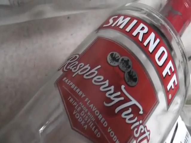
Smirnoff has a brand associated with partying, and often promotes itself through events, such as the Nightlife Exchange Project

Although there is no footage of anyone smoking in the video, the cigarette packets suggest this idea of youths smoking. Marlboro is one of the most well know brand of cigarettes. 'They represent the symbol of wildness and freedom' [marlboro]

Nike. A sports brand that has a strong reputation in youths, skating and other extreme sports, which is an important aspect in our target audience.
Thursday, 17 February 2011
Links with TV
As 18 year olds, Emma and I are in the age range of our productions target audience.
This has allowed us to include influences from some of the programs we watch, in order to create verisimiltude for the theme and genre of our music video.
skins pres
The opening sequence of series 3 of skins, where Freddie skateboards down the mainstreet in Bristol was very influential for our media coursework. It has been disabled for embedding, but here is the link to it on YouTube
Making of episode 1, series 3 of skins.
Rough Cut Audience Feedback
Our rough cut was shown to the other media class during their lesson.
We weren't there to give a brief synopsis of our rough cut, nor tell them what was missing, or footage that was simply there to give an example of what actual shots will be replacing.
So based on minimul background knowledge of our music video, here is the feedback:

Regarding suiting our target audience, here is the feedback they gave:
Following our target audience, we aim to re-shoot and improve the following:
We weren't there to give a brief synopsis of our rough cut, nor tell them what was missing, or footage that was simply there to give an example of what actual shots will be replacing.
So based on minimul background knowledge of our music video, here is the feedback:
- Fish-eye transition random, needs re-doing. FX on shots v. good
- Sitting in the kitchen drinking is a bit slow - go straight to party?
- Like the party bit, but flickering too fast. Needs more exageration and bizarness
- Like the FX and shot variation. Editing needs to be quicker
- In car - unsure of lipsyncing? looked like its supposed to be
- Lipsyncing, done right, would work. should be more. Fish-eye disguesed emptiness of rave setting.
- Blurred motion FX - more of this would be good. Fish-eye really like and strobe works very well.
- Flows well, like the linear narrative.

Regarding suiting our target audience, here is the feedback they gave:
- Also good, but some a bit empty, unrealistic.
- Yes, some fast shots, cellar shots v good. - but some too slow
- A bit too slow, especially at the beginning Some framing - head out of shot
- Yes, theme works
- Yes , can relate to it. I see it happening.
- Works for TA, especially for students, not younger school ones though
- Yes, because of youth rebellion lifestyle
- as 18 - 24 it works, tho also appropriate for 15 - 17 audience.
Following our target audience, we aim to re-shoot and improve the following:
- Hopefully re-shoot some rave scenes, using fish-eye. - have strobe underneath camera to try and light up more of the face.
- Link up the fish-eye and normal scenes better - esp. when going from rave to Callum and Vicky going upstairs.
- Film the car scenes - lip sync.
- Again, noone picked up on the T-shirt change at the beginning - but still want to re-shoot.
- Maybe more, quick shots of drinking in the kitchen. - if not, speed up in editing
Wednesday, 16 February 2011
The Editing Process
Here is some brief notes regarding some of our decision making in the editing process of our music video.


There have been times where we've had to choose between different editing effects.
Some have been more simple, with something like the order in which shots appear, others needed a little bit more thought over, with the various effects available on Final Cut.
Here is an example of two clips which we have had to decide over.
Whether to keep it simple sequence which visually is easy to follow, or instead use effects to create a visual representation of the situation - being drunk.
- Originally the skateboarding scene was going to be majority snorricam, but as that seemed slow and quite dull, I broke it up with clips of him doing tricks. - Possible chance to shoot extra footage and add in more shots of him from different angles.
- The lighting whilst using the snorricam was very dark on his face, so using the editing tools, gamma, brightness and contrast, I have made it slightly lighter so it's easier to see his face.
- Added affect on Callum as he leaves the house and jumps on skateboard - ghost trails - which add the sense of fast movement in slow motion.
- Added a transition from the table & ring of fire to Megan and Nick doing a shot to signify a time change.
- Non additive dissolve - "Compares the pixels in the two clips and displays the lighter of the two as the first clip fades out and second fades in"
- Same transition used from the shot of Megan to the 'rave' scenes.
- Overlap of clips and 50% opacity on the sequence of Callum and Vicky going up stairs to connote a drunken memory - blurred and no correct order to sequence of shots, all just on top of each other.

Changes made after second rough cut
Our second rough cut featured all of our footage, with basic editing by being cut to roughly the right length and in the correct order. After getting some feedback on our second rough cut, and most people saying that they liked the footage, Emma and I then went back to Final Cut and started our final stages of editing.

- Cut and reverse. When Callum goes down the stairs, to make the shot a bit more interesting rather than one long take, we have cut and reversed 2 of the sections, in time to the beat of the song, to make it a bit more in sync with the song.
- Tighter cuts on the sequence of Callum going to the fridge, making it flow more smoothly.
- Instead of having the lip syncing in the car one continuous shot, we have split up the shot with some cut away shots, which in our second rough cut we had at the end of the sequence. This creates some more shot variation in the sequence.
- Getting out of the car - before I had cut the long pause between the car lights turning off and them getting out of the car. Dave picked up on the slight jump in editing, and so instead of cutting, we have split the clip into 3, and have the middle section sped up to around 140%, which I think gives a nice, subtle effect along with the part of the song as a cloud lifts and the lighting on the car shifts. (easier to see visually than explain)

- From audience feedback, we were told that the transition from normal lens to fisheye wasn't very smooth. After playing with some different effects, we have put on Light Rays effect, which distorts the image with bright rays of light. Using this affect on the shot of the DJ, and then the beginning of the fisheye clip, creates a more subtle transition as well as a time ellipsis effect.

- The ending of the video, where Callum and Vicky go upstairs, the lighting seemed really bright and a bit unreal in the situation of a house party and so using the Desaturate effects, I changed the colouring a little bit, just to make it match the rest of the footage more.
There have been times where we've had to choose between different editing effects.
Some have been more simple, with something like the order in which shots appear, others needed a little bit more thought over, with the various effects available on Final Cut.
Here is an example of two clips which we have had to decide over.
Whether to keep it simple sequence which visually is easy to follow, or instead use effects to create a visual representation of the situation - being drunk.
Subscribe to:
Posts (Atom)